Editorial note
The three of us set out to modernize the language and add clarity to the text for the purpose of gently introducing a pre-teen audience to Shakespeares work. As a group, we feel that a large part of this class is not just learning about Shakespeares works and analyzing plays, but also learning how to engage with these texts. We feel that Shakespeare can often be daunting at first glance and want younger students to be able to engage with his work on their level. Also, as most people probably can relate to, most instructional aids to younger students such as No Fear Shakespeare can sacrifice the prose and lyricism of Shakespeares work, and all texts meant for older students such as us only add clarification or historical context. With that in mind we wanted to create a middle ground. We wanted to maintain the lyricism of the original text as that is where the majority of the beauty can be found. Any red text refers to changes that we made for clarity's sake, not including simple modernization of spelling. We also added in color coding of themes present throughout the text as follows:
Pink - Love
Brown - Concealment, Shame, Disguise
Blue - Anti-semitism
Yellow - Clarity, Revelation, Light
All colors were chosen as we thought that they naturally went together as society views them, pink is often associated with Valentine's Day and love, brown is associated with the ground and darkness, blue is a color of many Jewish holidays, and yellow is the 'color' of the sun and many other sources of light.
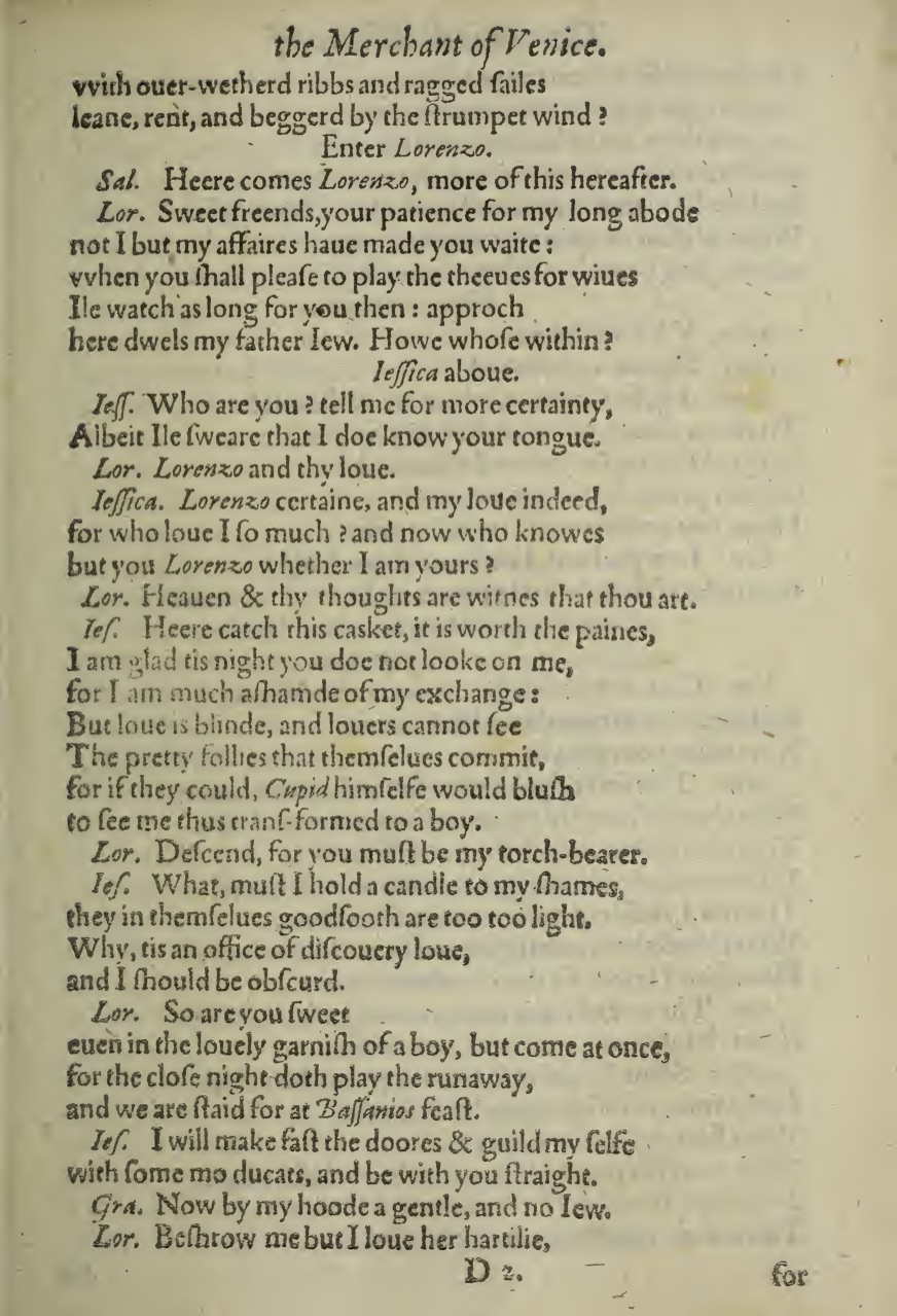
Image credit: Rare Books & Manuscripts Department, Boston Public Library, copy G.176.16. The most excellent historie of the merchant of Venice. First Quarto. London: 1600.
Citing this page: Shakespeare, William. The Merchant of Venice, D2r. London: 1600. Cacodemon Digital Shakespeare. Edited by Charles Carrol, Lara Graber-Mitchell, and Carl Serhan. Source edition: Rare Books & Manuscripts Department, Boston Public Library (copy G.176.16). http://cacodemonshakespeare.com/comedies/merchant/d2r.
